🧱 Component Structure
Token Driven Foundations
In a mature design system, components are not assembled ad hoc. They are built intentionally, following the same logic as a language where every word has meaning and every sentence follows rules. Those rules come from design tokens, which define spacing, color, typography, elevation, and other core styles. By constructing components from these tokens, you create a scalable foundation that is easier to maintain and evolve over time.
This token driven approach ensures consistency across products and platforms. A single token value, such as spacing or border radius, can be updated centrally and immediately reflected in every component that uses it. This reduces the risk of drift, makes audits more predictable, and aligns designers and developers around the same source of truth.
If you have already reviewed the Design Tokens section, you have seen how these foundational variables are defined. Here, we show how those definitions flow directly into real UI components, forming the bridge between abstract values and tangible interfaces.
Visualizing Component Anatomy
Components are composed of parts, each tied back to a token. Understanding this anatomy makes maintenance and iteration easier. For example, a card’s padding, corner radius, background color, and shadow all reference defined tokens rather than hardcoded values. This approach means each part of the component is traceable and intentionally governed.
Card Component Anatomy
- Padding:
--spacing-md - Radius:
--radius-card - Background Color:
--color-surface - Shadow:
--shadow-elevation-1 - Typography:
--font-size-md
Figure 1. A card component anatomy mapped directly to token sources, showing how foundational values influence every surface.
When you adjust a token, such as --radius-card, that change immediately propagates to all components referencing it. This ensures consistency, reduces manual edits, and makes global re‑theming or accessibility improvements far simpler.
This model also provides a clear audit trail. You can look at any component and see exactly which token governs each property, making onboarding and troubleshooting much faster.
From Design to Code
Tokens create a seamless path from design to implementation. A spacing decision in a Figma file is translated into a semantic token, which is then referenced in component code and rendered in the live interface. This creates a single chain of logic rather than a series of disconnected handoffs.
- Spacing value defined in design tooling
- Semantic token created in your system
- Component references token directly
- Live interface reflects the change instantly
Figure 2. The path from design intent to implemented UI through token driven logic.
This alignment removes ambiguity. Designers stop guessing how something will look in production. Developers stop interpreting specs in different ways. Quality engineers verify against tokens instead of assumptions. It is a workflow that scales without losing clarity.
Why Token Driven Thinking Matters
When every property is tied to a token, your design system gains governance, consistency, and resilience. Tokens provide a shared vocabulary that all contributors understand, and they define how spacing, color, and interaction patterns apply across every platform.
- ☁️Tokens provide a single source of truth for all component styles
- ☁️Behavior and appearance inherit directly from token logic
- ☁️Themes and platform variations become easy to manage
- ☁️System wide updates are safer with centralized governance
- ☁️Visual consistency emerges naturally from shared definitions
Figure 3. Benefits of token powered components, highlighting why centralized logic scales.
When these benefits compound across dozens of components, the result is a system that feels unified and professional, regardless of who built or touched each element.
Token Reuse Across Components
Tokens are not siloed to one component. When multiple components share background colors, shadow levels, or corner radii, the interface naturally gains rhythm and harmony. Users perceive a single product identity rather than a patchwork of mismatched elements.
Uses
--radius-sm, --color-primaryUses
--spacing-md, --radius-cardUses
--font-size-md, --color-surfaceFigure 4. Multiple components sharing the same token values, reinforcing consistent behavior and appearance.
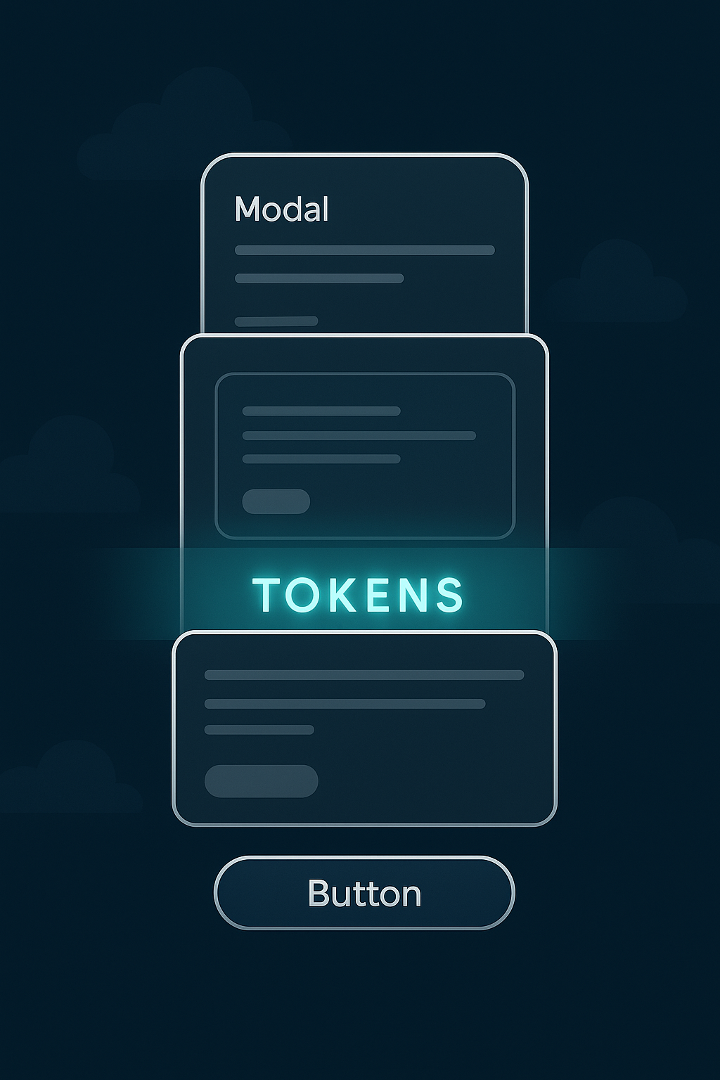
Figure 5. Token reuse across layers creates a consistent visual stack across product views.
This reuse simplifies maintenance. A single token update can align entire product surfaces, from dashboards to modals, without introducing inconsistencies.
Dependency Mapping and System Insight
As your design system matures, tokens begin referencing other tokens, creating relationships that enable themes and aliasing. Visualizing these relationships prevents accidental breaking changes and makes system maintenance far more predictable.
Figure 6. A token dependency tree mapping relationships across components and semantic layers.
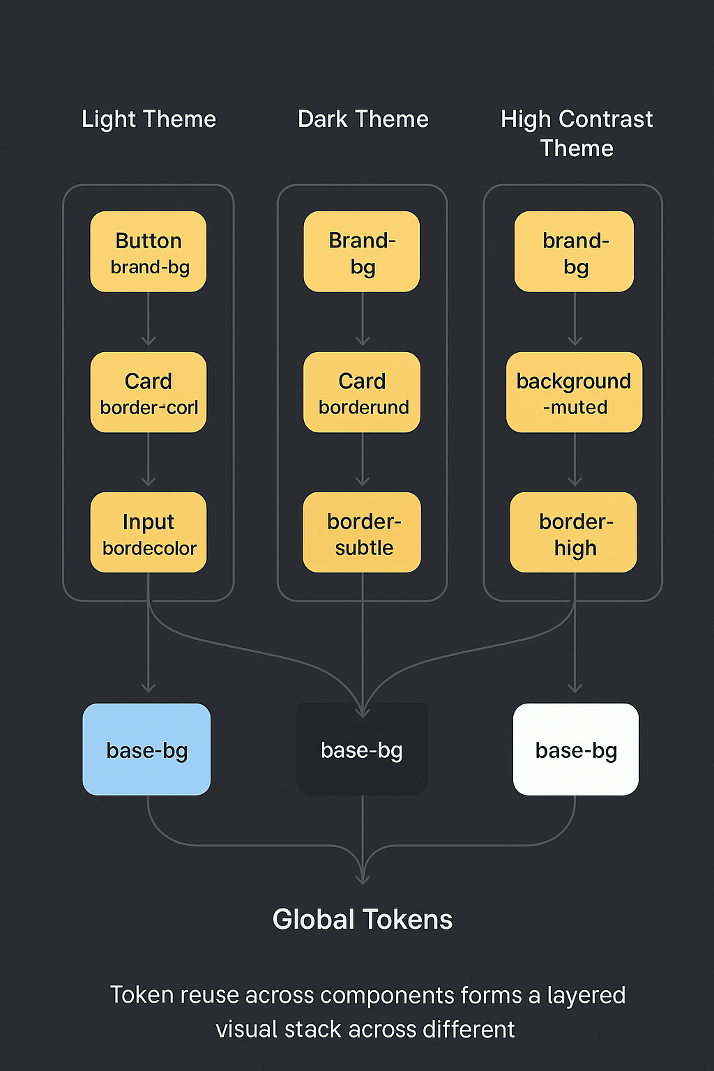
Figure 7. How token aliases resolve across themes and component layers.
These dependency views reveal hidden complexity. By auditing token relationships, you can clean up unused values, resolve conflicting aliases, and ensure updates cascade logically rather than unexpectedly.
Before and After: Tokenization in Action
❌ Before
font-size: 20px;padding: 16px;color: #3F8CFF;✅ After
font-size: var(--font-size-lg);padding: var(--spacing-md);color: var(--color-primary);Figure 8. A comparison between hardcoded styles and tokenized values, demonstrating flexibility and long term maintainability.
Hardcoded values may work for a single page, but they do not scale. They resist theme updates, make accessibility fixes difficult, and create long term design debt. Tokenization unlocks adaptability, letting you modify and evolve design rules without touching every line of code.
Use tokens instead of hardcoded values to ensure consistency, scalability, and alignment between design intent and implementation.
A token driven system becomes more than a collection of components. It evolves into a framework that supports innovation, simplifies maintenance, and keeps design intent intact from concept to delivery.
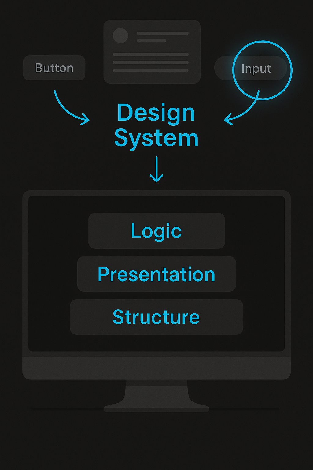
Figure 9. A design system that functions like an operating system, coordinating logic, presentation, and structure across your UI.
Recap and What’s Next
In this section, you explored how design tokens form the backbone of every component. We covered anatomy mapping, token inheritance, dependency insights, and the visible benefits of centralized logic. These practices ensure components remain consistent, maintainable, and ready to adapt as your product evolves.
With this foundation in place, your system becomes more than a toolkit. It is a platform that enables faster iterations and predictable updates. As your team grows, these principles prevent regressions and support scaling across new product lines.
Next, you will move into Versioning Strategy. Here you will learn how to evolve tokens and components responsibly over time. You will see how to deprecate old values, introduce new themes, and manage semantic intent without creating unnecessary churn. A strong versioning approach ensures that your design system remains future proof while continuing to serve current needs.