✍️ Contribution Guide
A design system is more than a library of components, it is a shared contract that binds teams together. Every button, badge, layout rule, and token carries intent. It is how we scale consistency, performance, and brand integrity across products. Without thoughtful contributions that respect the system, coherence erodes. Updates fragment into isolated fixes, and logic stops flowing as a unified language.
At Cumulus, contribution is not a side task, it is a systemic responsibility. When you submit a change, you are shaping the foundation that others will build on. Contributions are expected to be reusable, documented, tokenized, theme aware, and accessible from the start. This is how we protect clarity and prevent regression as our ecosystem grows.
This guide shows you how to create contributions that meet those expectations. You will learn what defines a system‑ready component, how tokens drive every decision, how to document effectively, and what reviewers look for during a pull request. Think of this not as a checklist but as a shared operating model that ensures the system stays healthy.
A contribution done well is more than a fix, it becomes a pattern that scales. A single tokenized component can power multiple products, adapt to different themes, and remain relevant through years of iteration. This guide is here to help you achieve that level of impact.
Contribution Personas
Not all contributors come from the same perspective. Designers drive visual intent, developers translate decisions into code, writers shape language and educational clarity, and QA specialists validate against accessibility and edge cases. These are not separate silos but complementary viewpoints that strengthen the system when aligned.
Understanding your role helps you see the broader context. A developer should think about token structure and responsive states. A designer should consider semantic color usage and accessibility patterns. A writer should embed clarity and glossary terms. Each perspective is unique, but expectations are shared and contributions should be aware of their downstream effects.
Figure 1. Common contributor personas and the shared responsibilities they bring to the system.
You are not required to master every domain, but you are expected to respect the system beyond your own expertise. Designers who understand token rules name elements more intuitively. Developers who grasp documentation flows create better handoffs. Writers who understand component behavior produce clearer explanations. This awareness keeps contributions aligned instead of isolated.
When each perspective understands the others, the system grows as a cohesive whole. It prevents duplicated effort, conflicting approaches, and hard‑to‑maintain work. With this in mind, let’s examine what elevates a component beyond functionality into true system readiness.
What Makes a Good Component
A working component is not enough. In Cumulus, a component must scale. That means it supports theming, uses tokens consistently, represents every state, and is accessible by default. A component should never rely on hardcoded values. It should be adaptable and understandable to anyone who uses it later.
A system‑ready component is clear in intent and structure. Its props are expressive, its logic modular, and its styling grounded in tokens. When a reviewer reads your code and documentation, they should feel confident integrating it immediately. Predictability and clarity build trust, which is the hallmark of reusable work.
Tokenization is the foundation. Do not hardcode pixel values; reference spacing tokens. Do not insert raw color codes; use semantic color tokens. Motion, elevation, typography, and spacing all have token equivalents. By following these patterns, your component instantly inherits theme support, accessibility considerations, and global consistency.
Interactivity is equally important. Every state a user might encounter—hover, focus, active, disabled, and error—should be implemented and previewed in Storybook. It is not optional. Storybook is the mirror of your component’s capability. Include responsive variations and confirm behavior in both light and dark modes. A system component must succeed in many contexts, not just one.
Documentation completes the process. Your .mdx page should explain the component’s purpose, detail its token usage, outline keyboard access, and include examples. Use visuals with <CloudFigure> and embed contextual guidance where appropriate. A well‑documented component educates future contributors, making your work multiply in value.
Before: Incomplete Contribution
- Hardcoded styles
- Missing interaction states
- No documentation
- No token usage
After: Ideal Contribution
- Fully tokenized styling
- Comprehensive Storybook states
- Clear documentation with visuals
- Responsive and accessible behavior
Figure 2. A comparison between incomplete and ideal contributions, showing how system readiness adds lasting value.
This difference is visible in every review. Incomplete contributions create friction and maintenance cost. Ideal contributions multiply system value, reduce future effort, and teach best practices. The next step is to understand how these principles play out across the entire contribution lifecycle.
From Design to Merge: The Lifecycle
Every contribution begins with intent. Define the problem you are solving and the system gap you are closing. Clear intent aligns your reviewers and prevents duplication. Without intent, even a technically correct contribution can feel misplaced.
Once intent is clear, propose any required tokens. New visual values must be captured as tokens with semantic names that fit existing structures. A token proposal links your design to implementation, ensuring future adaptability without scattered overrides.
Development follows. Build your component with semantic markup and tokenized styling. Confirm that it functions in light and dark modes, across breakpoints, and with keyboard navigation. Test accessibility features such as ARIA attributes and screen reader clarity. A component is not complete until it meets these standards.
Create your Storybook preview. Include every interaction state and edge case. Use controls to show prop variations. A reviewer should be able to see exactly how the component behaves without leaving the Storybook environment. Storybook is both a test bed and a living showcase.
Then document everything in your .mdx file. Use long‑form narrative, token references, and visuals to explain usage. Clarify edge cases, accessibility requirements, and intended contexts. A strong documentation page is what allows others to trust and adopt your work quickly.
Figure 3. The Cumulus contribution lifecycle, illustrating how ideas progress through design, development, and documentation before merging.
When you open a pull request, include screenshots, a link to design references, and a clear explanation of the tokens you introduced or updated. Your pull request should tell the story of the contribution, not just list file changes. This context speeds up review and establishes trust in your work.
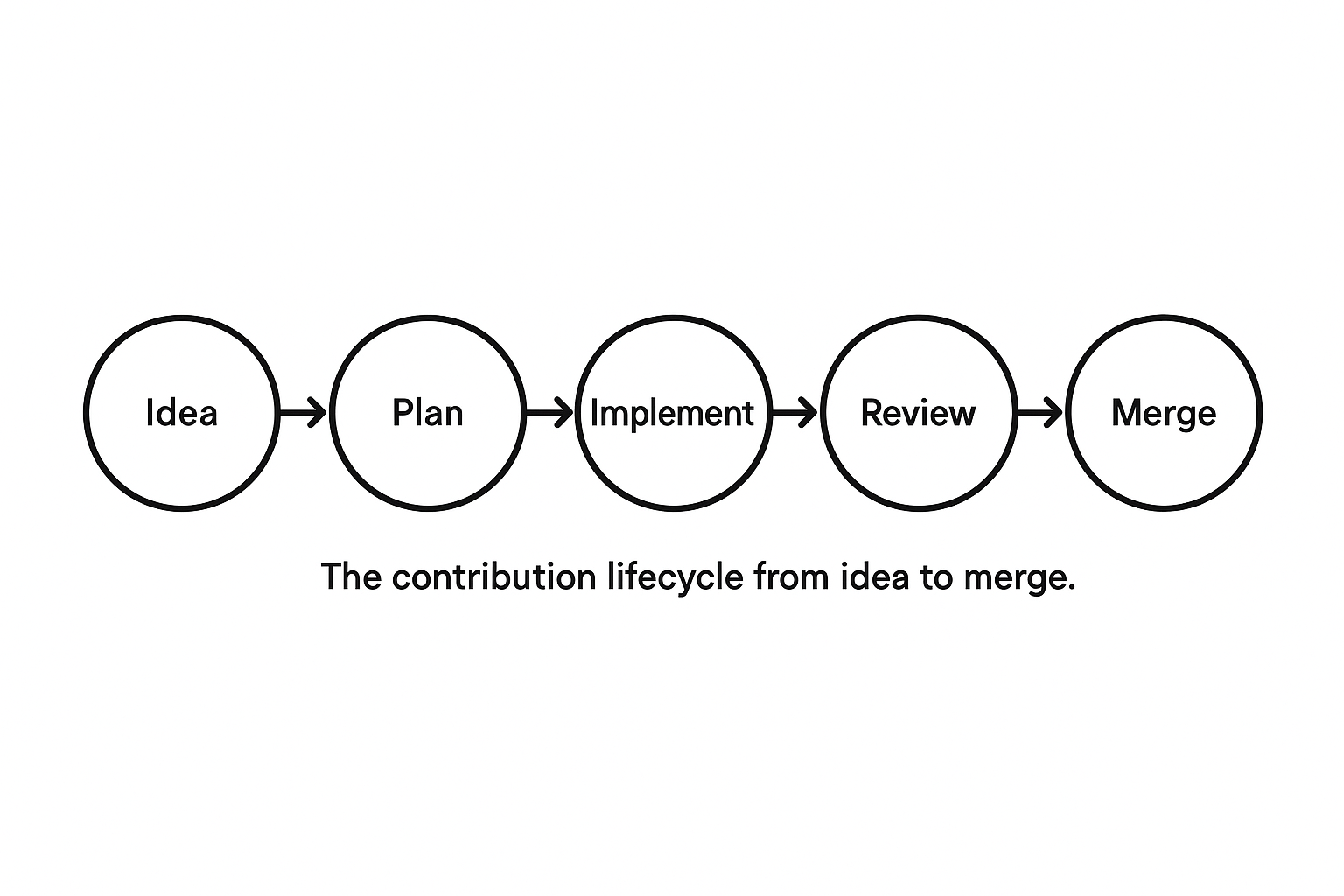
Figure 4. The complete lifecycle from idea to merge, guiding contributors toward systemic impact.
During review, each layer is inspected. Token usage, Storybook states, documentation clarity, and responsiveness are all evaluated. A contribution that covers the full lifecycle moves quickly through review. A contribution that skips steps creates delays and uncertainty.
Once approved and merged, your work becomes part of the system’s living knowledge base. It is no longer just your code. It becomes a reference, a teaching tool, and a foundation for future contributions. That is the goal of a system‑ready component.
Recap and What’s Next
Successful contributions begin with awareness. Awareness of system standards, token practices, accessibility requirements, and documentation principles. By following the full lifecycle, from intent through merge, you create assets that are stable, scalable, and easy for others to adopt. Every contribution strengthens the system when built this way.
This guide demonstrates that design systems are maintained through shared process and understanding, not isolated effort. Your Storybook previews, token usage, accessibility patterns, and documentation all reflect that shared responsibility. This is not extra work. It is the multiplier that allows teams to build faster and with confidence.
In the next section, you will explore accessibility in depth. You will learn how keyboard navigation, screen reader support, color contrast, and tokenized styling define what is acceptable inside the system. Accessibility is not a final step, it is a continuous lens applied to every component.
By mastering these contribution practices, you are ready to elevate your work to meet higher standards; standards that include every user, regardless of ability or environment. Continue to the accessibility section to see how inclusivity is built directly into the DNA of Cumulus.