📐 Style Rules
A design system cannot succeed without enforceable structure. Without rules, even the most beautiful components collapse under inconsistency, last‑minute hacks, and unpredictable edge cases. A mature design system is more than a library, it is a visual language that every contributor can speak fluently. At Cumulus, this language is defined through style rules that shape spacing, rhythm, composition, typography, and interactivity.
These rules are not arbitrary. They are strategic constraints designed to prevent drift, reduce rework, and build visual trust across every surface. When style rules are honored, interfaces feel effortless. When they are ignored, systems fracture and teams lose confidence. Think of these rules as the blueprint and the guardrail—a shared contract that keeps design and development aligned.
📏 Layout and Spacing Rhythm
Spacing is the heartbeat of an interface. It creates rhythm, and rhythm drives flow. A clear rhythm is what makes complex dashboards or dense forms feel approachable rather than chaotic. Cumulus uses a fixed set of spacing tokens: 4px, 8px, 16px, 32px—to govern all padding, margins, and grid gaps. These values act as the “beats” in our design music.
Figure 1. A predictable spacing rhythm versus irregular intervals. Introducing off‑system values like 12px disrupts alignment and creates hidden maintenance costs.
Why this matters: Predictable spacing ensures that every designer, engineer, and reviewer speaks the same language. Developers stop debating arbitrary values, designers stop eyeballing margins, and layouts adapt more gracefully to responsive contexts.
Common Pitfall: Avoid introducing “one‑off” spacing. A single hardcoded value can snowball into dozens of inconsistencies that are hard to trace later. When in doubt, choose the nearest approved token.
🔤 Typography Consistency
Typography is the voice of your interface. It must be clear, scannable, and trustworthy. Inconsistent heading levels, mismatched line heights, or random font weights create cognitive friction. At Cumulus, we enforce distinct type scales and tokenized font sizes so that hierarchy remains obvious.
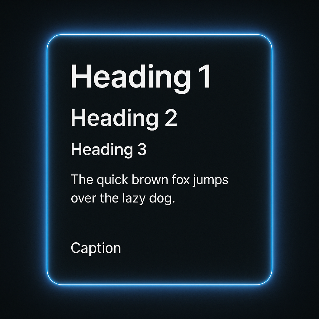
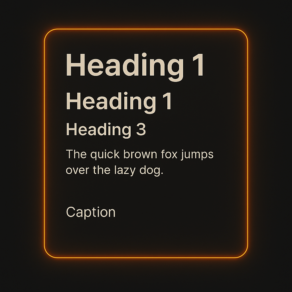
Figure 2. Strong typography versus weak typography. Distinct spacing and scale prevent users from getting lost in content.
Headings should always follow semantic intent, an H2 must visually separate itself from an H3. Spacing above and below text blocks follows vertical rhythm tokens, ensuring headers do not collide with content.
Common Pitfall: Reusing the same size for multiple heading levels or applying bold weights indiscriminately. This erodes visual hierarchy and creates uncertainty for both users and maintainers.
🧱 Component Composition
Every Cumulus component follows a defined structure: a header zone, content zone, interaction zone, and feedback zone. These are not loose suggestions, they are enforced patterns that ensure consistency across every component type.
Component zones align to tokenized spacing and layout logic.
Figure 3. A clear component anatomy creates predictable layouts and reduces error states.
Why this matters: Without structure, contributors insert features wherever they see fit, leading to drift and confusion. By following these slots, new features integrate seamlessly with existing layouts.
Common Pitfall: Placing error states or buttons outside their designated zones. This creates misalignment, especially in responsive designs where stacking behavior matters most.
🖱️ Interactive Feedback
Feedback is guidance. Hover states, focus rings, and active states tell users where they can act. Without them, users are left guessing which elements are interactive.
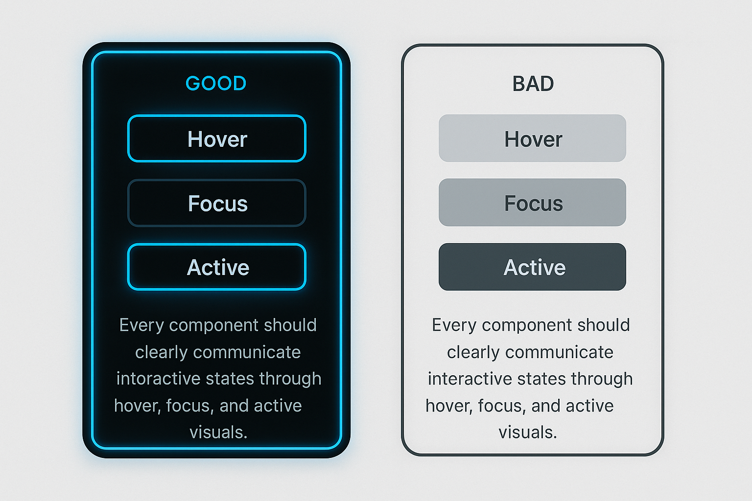
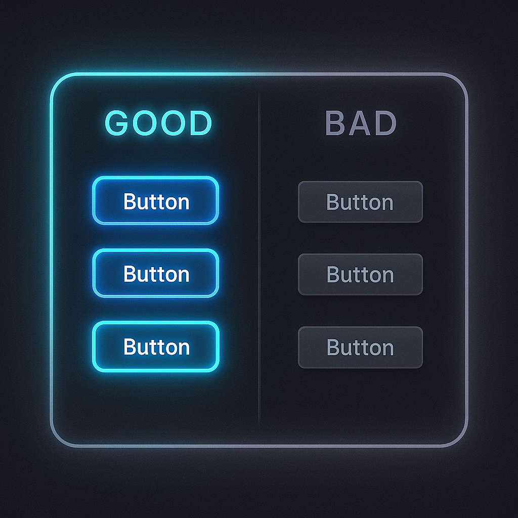
Figure 4. Feedback done well uses glow and motion to show readiness, while poor feedback leaves users uncertain.
Cumulus applies glow states for key actions. Keyboard focus states must meet WCAG contrast ratios and be visible across themes. Transitions are tuned for 150ms ease‑in‑out, giving smooth feedback without distraction.
Common Pitfall: Removing focus outlines without providing a replacement. This breaks accessibility and leaves keyboard users stranded.
🌗 Theme‑Aware Elevation
Elevation communicates depth. In light mode, soft shadows imply hierarchy without stealing attention. In dark mode, shadows lose contrast, so glows replace them to maintain clarity and comfort.
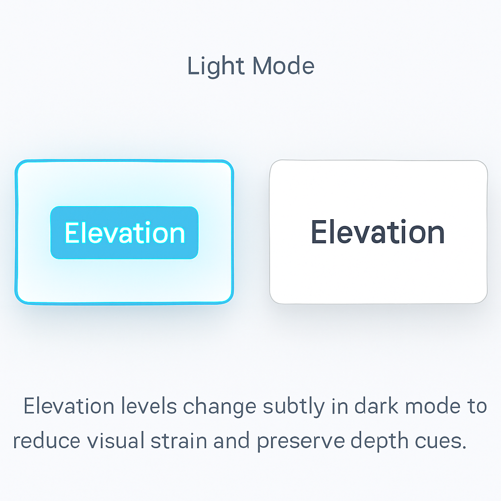
Figure 5. Subtle shadows create layers without visual clutter.
Why this matters: Overly strong shadows feel heavy and cheap. Instead, use gentle shadows that scale with component priority, always respecting token spacing and alignment.
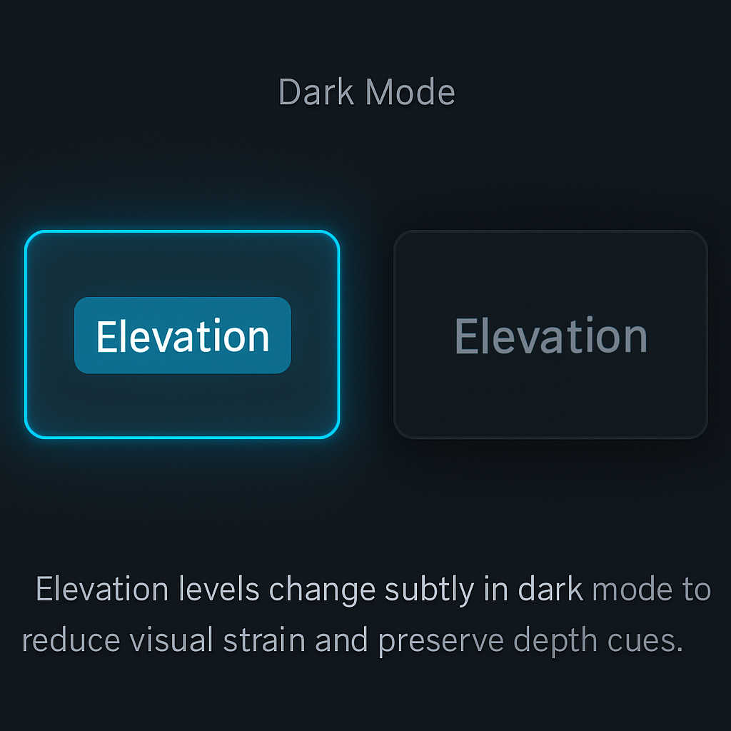
Figure 6. In dark mode, soft glows define hierarchy where shadows would otherwise vanish.
Common Pitfall: Copying light mode shadow tokens into dark mode without adjustment. This leads to muddy layers and inaccessible contrast. Always verify elevation cues in both themes.
✅ Recap
Style rules are non‑negotiable building blocks. They accelerate design and development by removing guesswork and enforcing a shared vocabulary. Spacing, typography, structure, feedback, and elevation are all connected—break one, and the system loses integrity.
Cumulus’s style rules are not just preferences. They are governance tools that keep your product scalable, accessible, and polished. Respect these rules, and your components will feel cohesive even before real content is added.
Next up: we connect visual rules with logic. In the Auth & Permissions section, you will see how components adapt to user roles, making your system not just beautiful, but secure and dynamic.